
Modernizing a Colonial Home with Art, Rhythm, and Refined Eclecticism
The Narrative
Some families are busy, and then there are families that move to a rhythm. This one does both.
A high-performing household of five, executives by day and creatives at heart, they fill their home the way they fill their lives. Music plays often, dancing happens casually, and even with full schedules, there is an undeniable sense of joy in the everyday. They didn’t want a house that felt like a corporate exhale. They wanted a home that pulsed with artistry, conversation, and movement.
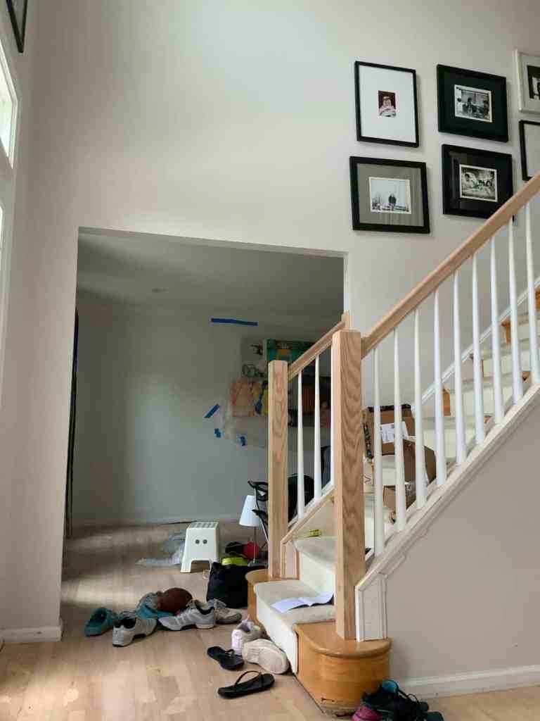
The architecture was traditional colonial, complete with a choppy layout and familiar bones. The vision, however, leaned toward refined eclecticism. They wanted depth without chaos. A space that felt intelligent, expressive, and unmistakably theirs.
Modernizing a colonial without stripping its soul requires restraint. And when your clients are creatively inclined, restraint becomes an art form in itself.
Intention
The guiding principle throughout the home was balance. Bright and airy, but never flat. Eclectic, but edited. Art-forward, but not overwhelming.
We weren’t chasing trend; we were building atmosphere. Every decision filtered through one question: Does this spark something? Conversation. Curiosity. Comfort. Energy.
Texture, pattern, and layered materials created movement from room to room, allowing a subtle visual rhythm to mirror the way this family lives. Traditional millwork remained where it made sense, while modern silhouettes stepped in when the visual weight needed adjusting. Art was treated as architecture rather than afterthought.
This project was about flow. A creative current running consistently through the home, carrying momentum without noise.
Execution Highlights
Rather than erase the traditional framework, we chose to contrast it. Clean-lined furnishings, sculptural lighting, and thoughtful material shifts gave the colonial envelope a fresh pulse without fighting its origins.
In the foyer, a retro graphic wallpaper layered above crisp wainscotting broke up the dramatic vertical expanse of the two-story entry. The scale feels intentional, not overwhelming. Replacing the stair balusters with a refined stiletto profile subtly modernized the space without calling attention to the update.
The kitchen required its own balancing act. Black cabinetry can feel heavy if left unchecked, so we introduced white oak warmth, strategic brass accents, and visual breathing room. The newly opened layout now supports three daily-use zones, cooking, bar, and breakfast nook, each distinct yet cohesive.
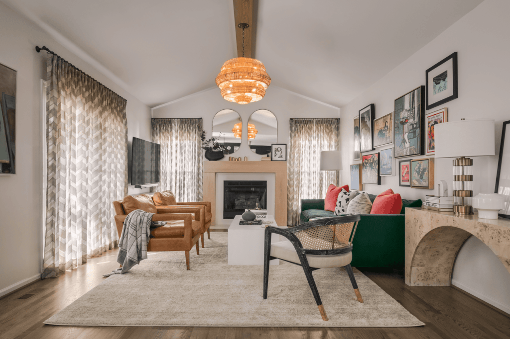
In the family room, a vintage-inspired green velvet sofa anchors the space with confidence. Above it, a layered gallery wall of Matisse prints, cultural ephemera, personal photography, and even a Korean postal stamp creates narrative and depth. The television was intentionally minimized, allowing conversation and art to take the lead.
The den demonstrates the power of proportion. Layered rugs, intentional seating placement, and controlled scale prevent the narrow footprint from feeling compressed. The result is collected rather than crowded.
Across the home, texture and contrast act as the throughline. Structured yet expressive. Edited yet full of personality.
Impact
The transformation is less about individual pieces and more about how the home feels.
Guests pause in the foyer, look up, and ask questions. The family room invites lingering, with conversations stretching longer than expected. The breakfast nook has become a quiet retreat between dance rehearsals, meetings, and the rhythm of daily life.
The house no longer reads as a colonial template. It feels curated, intentional, and alive.
One of my favorite moments was hearing a friend walk into the foyer and say, “Only a designer would think of this wallpaper.” She wasn’t wrong.
Rooms
Foyer
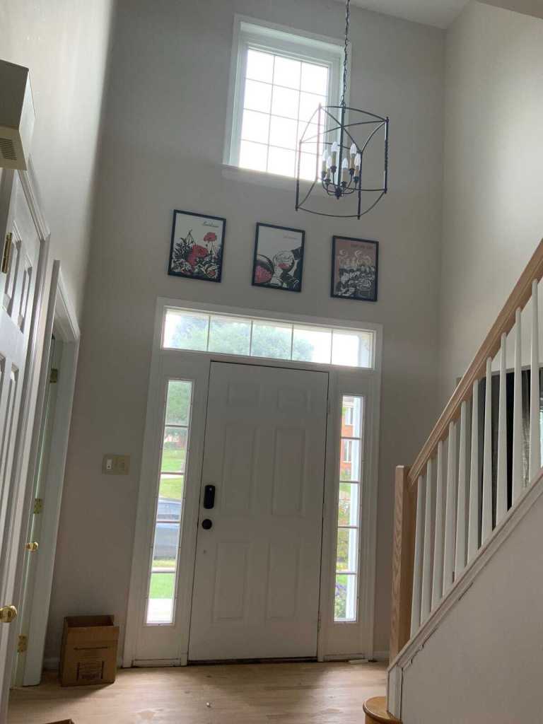
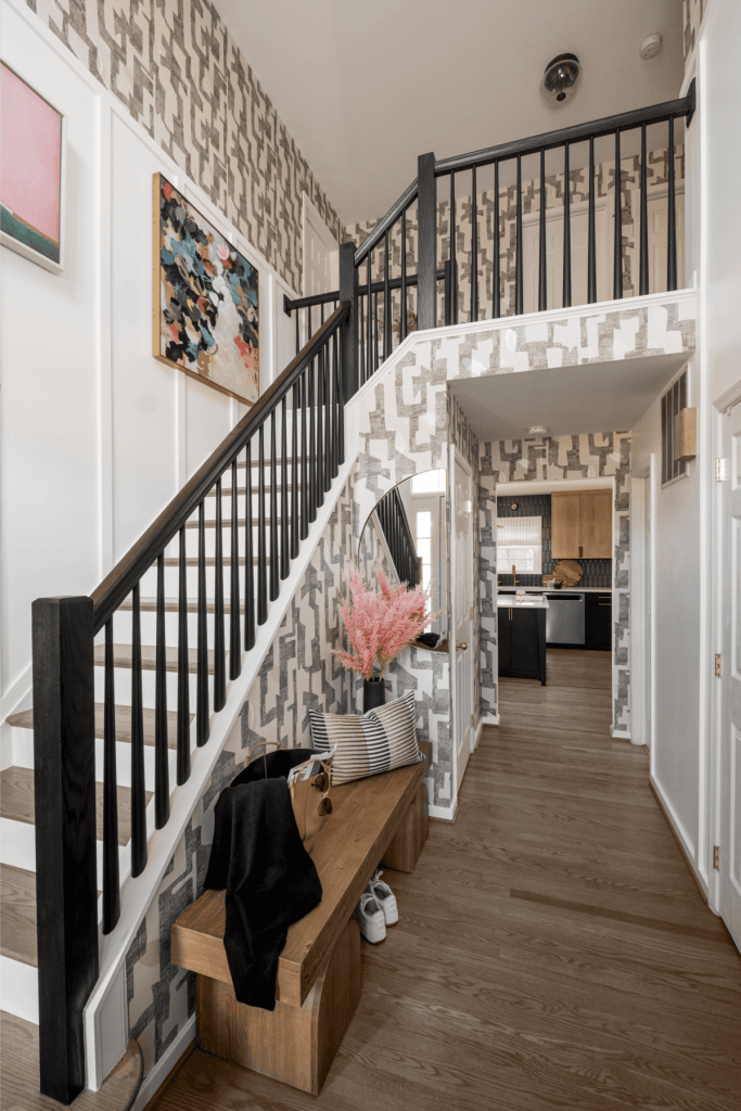
The foyer sets the tone for everything that follows. The once expansive yet undefined entry now feels layered and deliberate. Graphic wallpaper above tailored wainscotting introduces scale and texture, while curated artwork punctuates the white architecture with personality. A sculptural bench and half-moon mirror add dimension and light bounce, transforming empty wall space into a thoughtful gallery moment.
This is not a pass-through space. It is a statement of identity.
Kitchen & Breakfast Nook
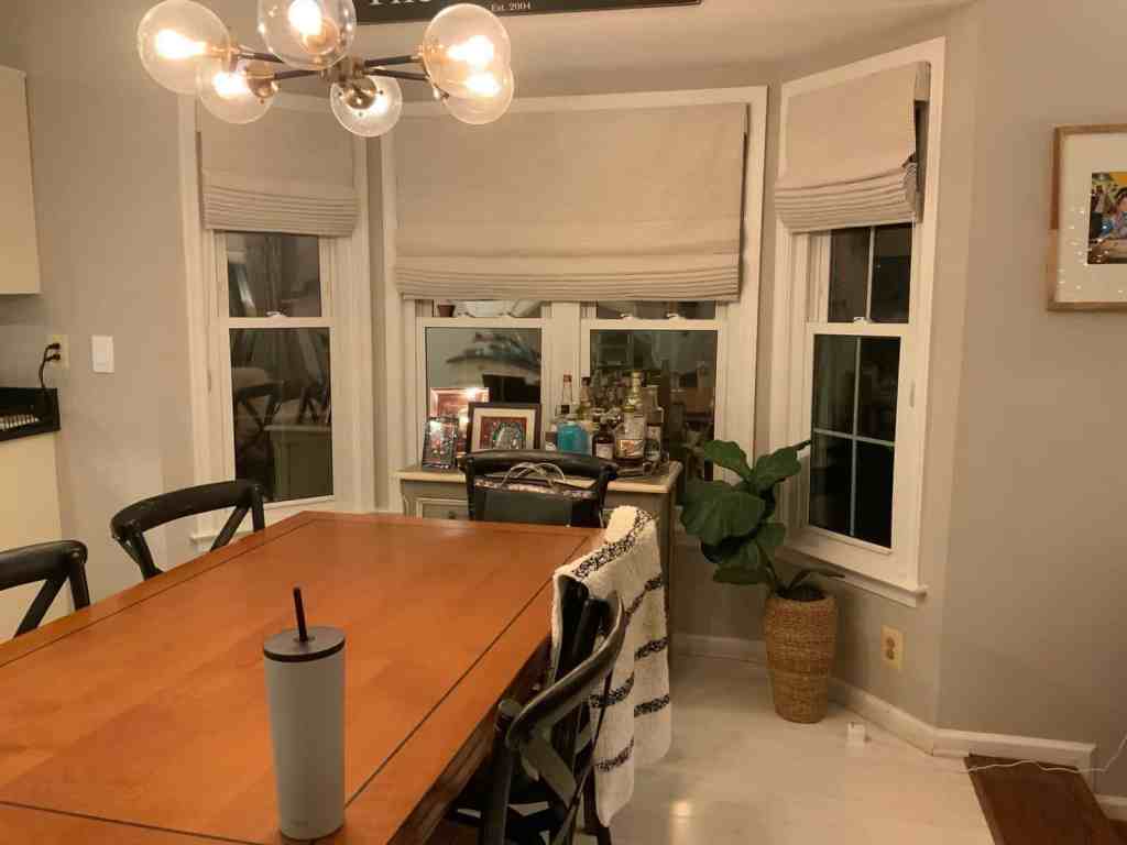
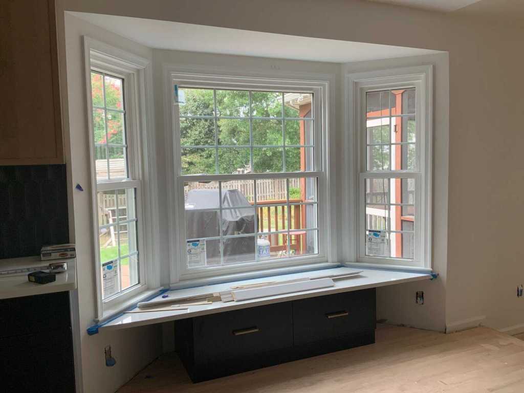
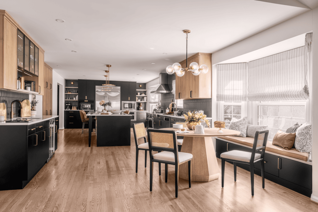
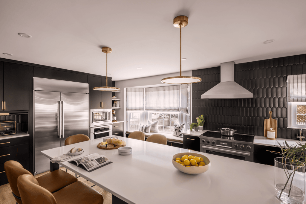

Removing the dividing wall reshaped both function and flow, allowing the kitchen to expand into a space that feels generous rather than segmented. The black cabinetry grounds the room with confidence, while white oak and brass soften the palette and prevent visual heaviness.
The breakfast nook is the quiet hero. Custom cushions, pillows, and Roman shades introduce softness against the strong cabinetry, creating a corner that feels equally suited for a family meal or a quiet afternoon with a book.
The result is modern yet warm, refined yet approachable. A black kitchen that feels timeless rather than trendy.
Family Room
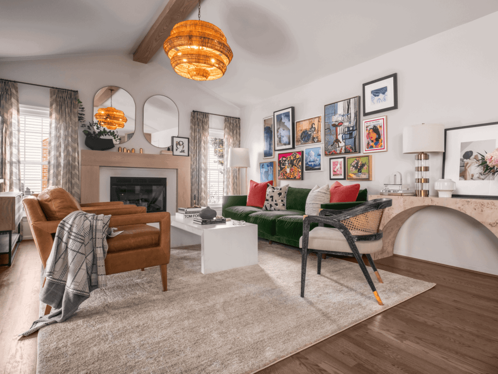
The family room is where personality takes center stage. A vintage-inspired green velvet sofa establishes the tone, bold but controlled. Leather chairs with modern lines balance the visual weight and create a comfortable conversation circle.
The redesigned fireplace ties into the white oak introduced in the kitchen, creating continuity across spaces. Above the sofa, the gallery wall blends fine art, cultural references, and personal photography into a layered narrative that draws people in.
The television is tucked away, no longer the focal point. Connection is.
Den / Sitting Room
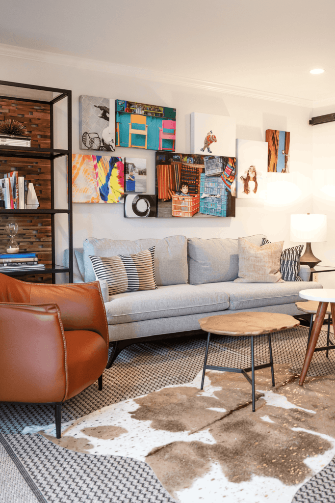
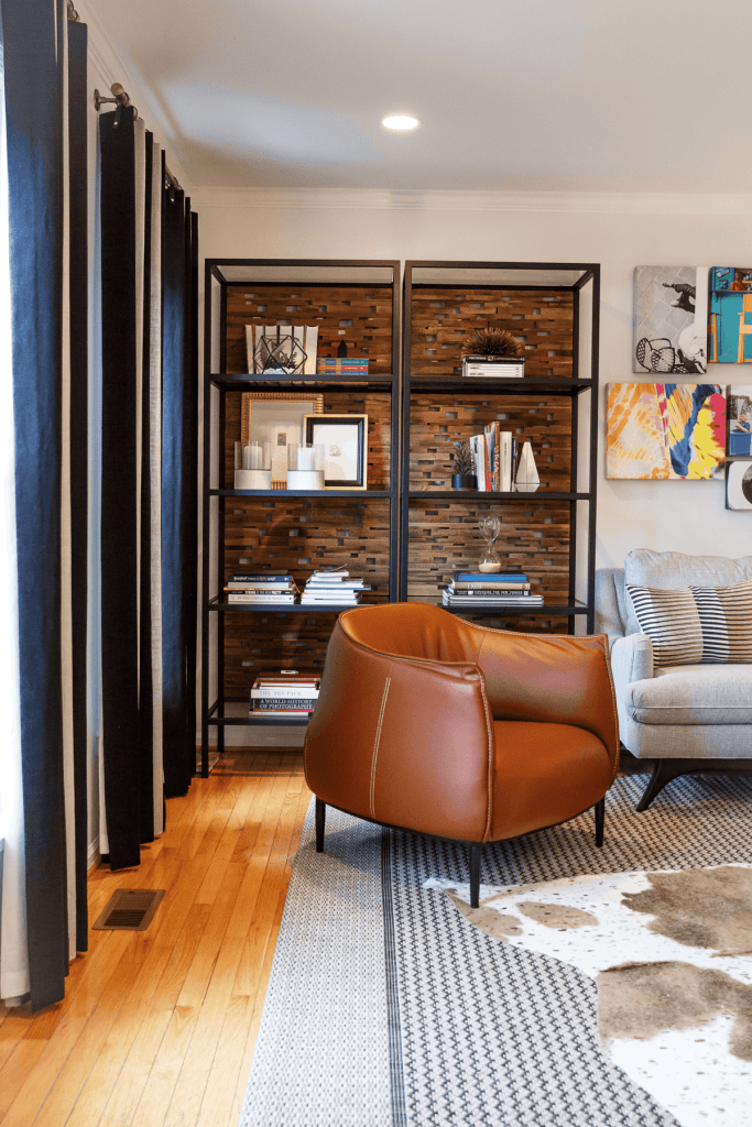

The den proves that thoughtful scale can completely transform a narrow room. Layered rugs add depth underfoot, while a custom bench balances the sofa without overcrowding the footprint. A leather club chair near the built-ins creates a natural moment of pause as you enter.
The walls, covered in the client’s photography, turn the room into a personal exhibition. Completed more than seven years ago, the space remains relevant, a testament to the longevity of quality materials and intentional design choices.
Leave a Reply