
A Family Room Meant for Connection
There’s a certain kind of room that looks calm at first glance—neutral, layered, finished—but never quite feels right when you’re actually living in it. This family room was one of those spaces.
On the surface, nothing was wrong. But the way the room functioned worked quietly against how people gathered, moved, and settled in. And that tension is something I see often, especially in older homes with charming architecture that doesn’t always cooperate with modern life.
This project became a case study in what happens when you stop adding and start editing.


The Real Challenge Behind This Family Room
My clients had two nearly grown teenagers and a busy household that naturally gravitated toward this space. It was meant to be the place where everyone landed: parents, kids, friends, guests.
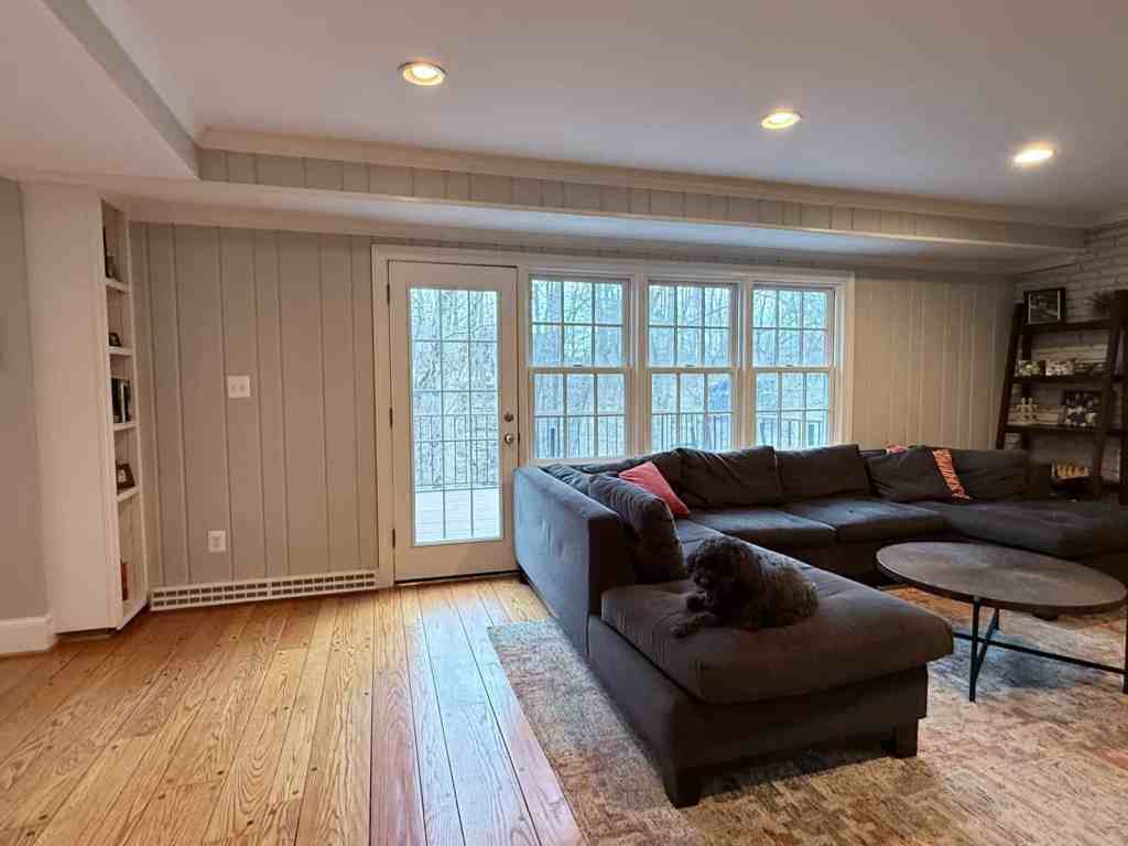
They had tried to make it work on their own, but nothing quite struck the balance they wanted. The room felt heavy and visually flat at the same time, even though it was well-used and comfortable.
What they couldn’t articulate at first, but felt every day, was that the room wasn’t supporting more than one way of living at once. It lounged well, but it didn’t invite conversation, movement, or flexibility.
That’s often the moment when homeowners assume they need more furniture, new furniture, or bolder furniture.
In reality, the issue here was architectural.

When Architecture Quietly Works Against You
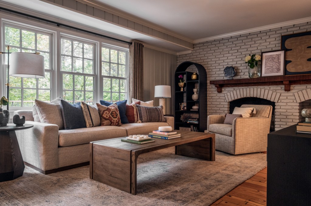
On paper, this room had a lot going for it. A long hallway draws you from the front of the house straight toward the back, where a wall of windows and a patio door overlook a stream and wooded landscape.
The problem wasn’t the view. It was how three architectural conditions interacted:
- A patio door cut directly through the seating zone, compressing where furniture could live
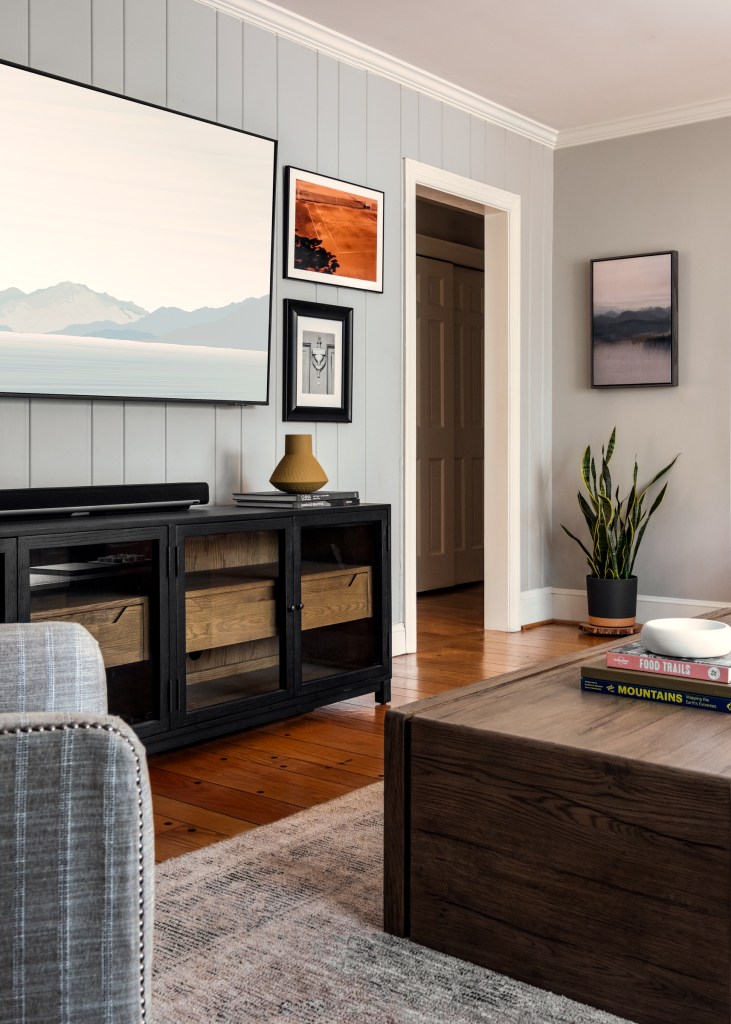
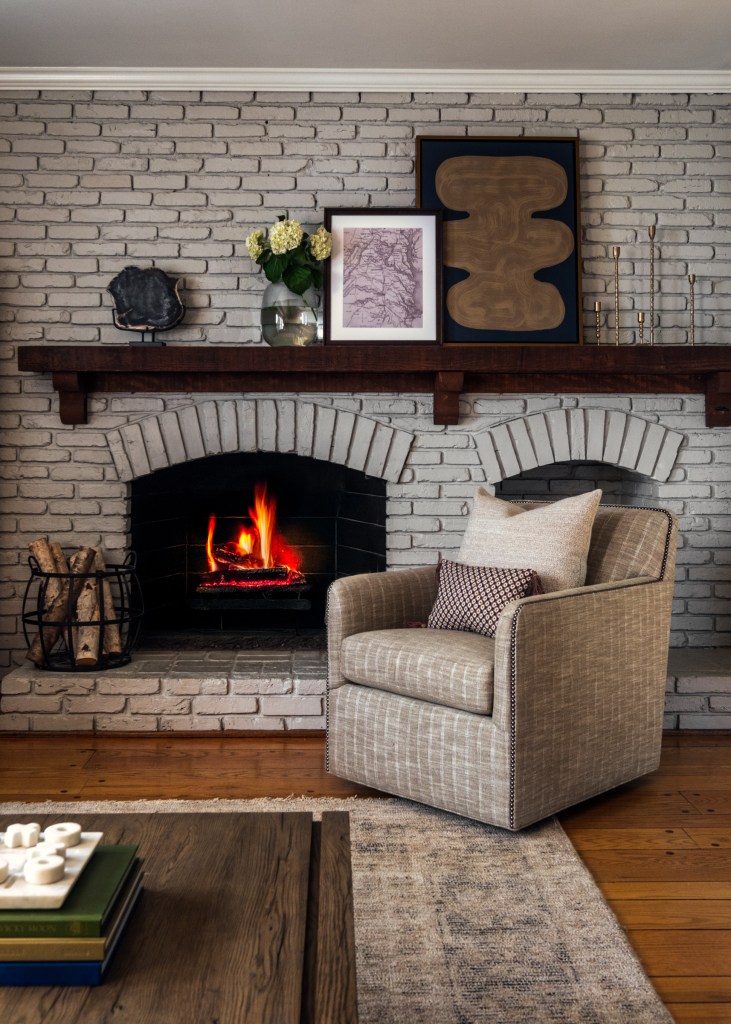
- The fireplace and television competed for attention on opposing walls
- A long, narrow footprint made the room feel more like a pass-through than a place to gather
None of these issues were dramatic on their own. But together, they prevented the room from ever fully settling.
This is where many rooms get stuck. They look finished, but they never feel resolved.
Editing the Room Instead of Structurally Changing It
Rather than forcing symmetry or following the architecture as it was, we edited the room by making three intentional design decisions.
I won’t walk through every detail here, as that’s documented step by step in the Design Edit. But the essence of the strategy was this:
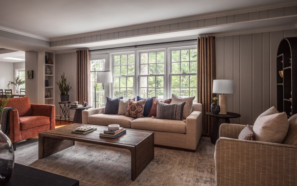
We needed to redefine where the room began and ended, soften architectural interruptions, and rebalance the room’s focal points so nothing felt like it was competing for attention.
Two of the moves worked together to expand the usable footprint of the seating area without changing the architecture at all. The third addressed visual weight by resolving the tension between the fireplace and the TV and allowing texture and negative space to do the work instead of making structural changes.
The result wasn’t just a room with new furniture. It was a room with more clarity.

The Conversation Circle
Before I design furniture layouts, I start with what I call the conversation circle. It’s not a formula. It’s a way of paying attention to how close people feel to one another, whether everyone can reach a surface, and whether seating encourages lingering instead of constant adjustment. When a conversation circle works, people don’t think about the room at all. They just stay. And when it doesn’t, no amount of beautiful furniture can fix the feeling. This room finally found its footing once those relationships between seating, rug size, table scale, and circulation were resolved.
A Room That Finally Supports Real Life
The true success of this space isn’t in how it photographs. It’s in how it’s used.
The family spends more time here now. The kids feel comfortable bringing friends into the space. And one small but telling detail: the swivel chair we added became mom’s favorite seat — no more hovering, no more negotiating for space.
Everyone has a place. That’s when you know a room works.
Want the Full Breakdown?
This blog post shares the thinking behind the room, but the Streamside Comfort Design Edit documents the exact layout decisions, proportions, and sourcing behind it.
Inside the Design Edit, you’ll find:
- Detailed furniture layouts and spacing strategies
- Rug sizing and placement logic
- Insight into how architectural interruptions were reframed
- A curated source guide for the furnishings used in the space
- The reasoning behind each major design decision
If you’re designing your own home or want to understand why certain rooms feel right, the Design Edit offers a deeper, more technical look at this project.
Explore the Streamside Comfort Design Edit below:

Photography by Lange Photo Studio.
$34.00Add to cart
Leave a Reply